
Billboards and MiniBoards
/ Billboards and MiniBoards

Our creative department is made up of imaginative and innovative professionals who intuitively apply their well-honed design skills to projects.
Not only location and timing but great creative design quite often gives you that cutting edge that you need in outdoor advertising.
When creating your own designs here are some guidelines you should consider.
Product Identification
Make sure the advertiser’s name is legible.
Concise Copy
Try to use a maximum of ten words or less.
Use Shorter words
Shorter words are more readily understood.
Large and Legible Type
Use bold and big type consider a viewing distance of 300-700 feet for words.
Forget “The Whitespace” Rule
This rule does not apply to Outdoor. Unlike Print, the actual viewing size is too small. It’s like having a 1″x3″ newspaper ad with a lot of white space.
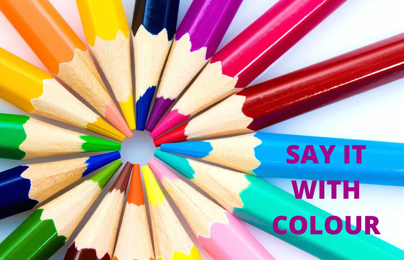
Bright Colors
Bring it and bring it bold.
Contrast
More contrast greater visibility.
Focus
One message.
Distance and Time
looking at your design from 15 feet simulates viewing from the road and looking at your design for 5 seconds simulates driving past the Billboard. So make sure your artwork is legible and your message can be read and understood in 5 seconds then you are good to go
Pay special attention to colours, for example colours of similar value such as red and green simply don’t work together as far as legibility is concerned and will produce very low visibility.
On the other hand, yellow and black are not similar in both hue and value providing the strongest contrast for traditional outdoor advertising design. White complements colors with light values.

Strong contrast in hue and value is essential for creating good out-of-home design. Hue is the identity of color while value measures a color’s lightness or darkness. Contrasting colors are best when viewing out-of-home designs from far distances.

The colour combination guide above is a good representation of the best contrasting colours to use 1 being the best and 14 worst.
Note: Digital LED units and other back light displays have some subtle differences in contrasts. But the difference is that most bright/light colors work well on a black background.
A strong image against an uncomplicated background is best for creating high impact visuals.

Hang Loose Not Tight, Kerning
Choose typefaces that are not subject to close kerning as this will certainly affect legibility from great distances.
Don’t Stack, Lead If You Have To
Wherever possible use just one line of horizontal text. This always make it easier to read than multiple rows of words. If an additional line of text is required make sure there is enough leading between lines to facilitate smooth transitioning
| Distance in Feet | Print Resolution | Resolution | Examples | Minimal Text Height in Inches | Minimal Discernible Text for Disclaimers |
|---|---|---|---|---|---|
| 5′ – 50′ | High | LCD | Malls, Airports, Retail, Lobbies, Office etc. | 1″ – 2″ | 1″ – 2″ |
| 50′ – 100′ | High | 6mm-12mm | Window, Street Display, Drive through | 2″ – 4″ | 2″ – 4″ |
| 100′ – 200′ | Normal | 12mm-18mm | Posters, Surface Streets | 4″ – 8″ | 4″ – 6″ |
| 200′ – 300′ | Normal | 18mm-20mm | Posters, Surface Streets and highway bulletins | 8″ – 10″ | 6″ |
| 300′ – 350′ | Normal | 20mm-24mm | Highway Bulletins, Highway Posters | 10″ – 15″ | 6″ |
| 350′ – 500′ | Normal | 24mm | Highways, Spectaculars | 15″ – 20″ | 8″ |
| 500′ – 600′ | Low – Normal | 24mm | Highways, Spectaculars, Stadiums | 20″ – 24″ | 8″ |
| 600′ + | Low | 30+ mm | Skyscrapers, Spectaculars, Set back from road | 24″ – 40″ | 9″ |
Mechanical Proportion & Scale • 1/2” = 1’ @ 300 ppi
Colour • CMYK
Tips for designing Digital boards and displays
Again, keeping it simple is always the key component in effective outdoor advertising design
The general rules still apply when designing for Digital outdoor media but there are some other considerations to keep in mind as outlined below
Large text
Outdoor designs should be simple, clear and easy to read. Digital Billboards should be legible from 500 feet away.
Apply Bold sans-serif fonts
Use large, legible typefaces. No decorative, italic, or serif fonts. As a general rule, upper and lower-case sans serif fonts are best. Additionally when creating for digital outdoor, it is strongly recommend that you add a thin dark stroke around the text to separate it from the background.
RGB Colour only
Use only rgb color files for digital boards. Design as you would for a website, tv or computer monitor.
No white backgrounds
To achieve white, a combination of all three colors must be turned on to their maximum brightness. Consequently, white backgrounds will wash out and compete with the remainder of your design.
Bold and Bright colours
Use fully saturated web-safe hues.
Image is key
Take a small object and make it large (like a watch) rather than a large object small (like a building). Avoid using landscapes or complex scenes. Use 3 visual elements or less, total e.g.: logo, image and headline.
Digital Billboard
 |
|
| File Size | 400 pixels h X 1400 pixels w |
| File Type | Uncompressed JPEG |
| Color Mode | RGB |
Digital Poster
 |
|
| File Size | 400 pixels h X 840 pixels w |
| File Type | Uncompressed JPEG |
| Color Mode | RGB |


